
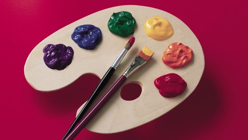
We live in a colorful world. From smartphones to laptops, clothes to websites, the world is a colorful canvas. But how do you decide your brand color palette? Worry not! You are at the right place because we are about to take a dive into the blog How to Choose a Brand Color Palette that Fits Your Brand Story. Let’s begin!
Colors alone can influence up to 90% of an initial impression. 90% is a huge figure! Think about McDonald’s. What comes to your mind? The yellow arches. The brand has done an amazing job with its brand color palette. It has become memorable, and it stays with you.

When you set up your business, it is indeed an exciting time. You think about colors, logos, brand names, and so much more. You create a complete brand identity for your business. But how often have you thought about colors and their impact on people? The color palette you establish for your brand will play an important role across all of your marketing channels, from how you develop a logo and design a business card to how you design your website and much more.
Using brand colors consistently across all platforms will give your business a unified style and experience, making it unique and memorable. They will also influence your customers’ behavior and experience, making them effective tools. This comprehensive blog covers all you need to know to help your business stand out with the appropriate brand colors.
What are Brand Colors?
Brand colors go beyond appearance. They are an effective tool for businesses to communicate their identity and values. Simply said, brand colors are the particular hues and tones selected by a business to portray its brand across all channels, from website to packaging to logo. A brand color palette is a collection of five to ten colors that are used to visually portray a business. A consistent and smart use of brand colors helps boost brand awareness and visibility.
Why are Brand Colors Important?
Brand Colors trigger Emotions and Relationships
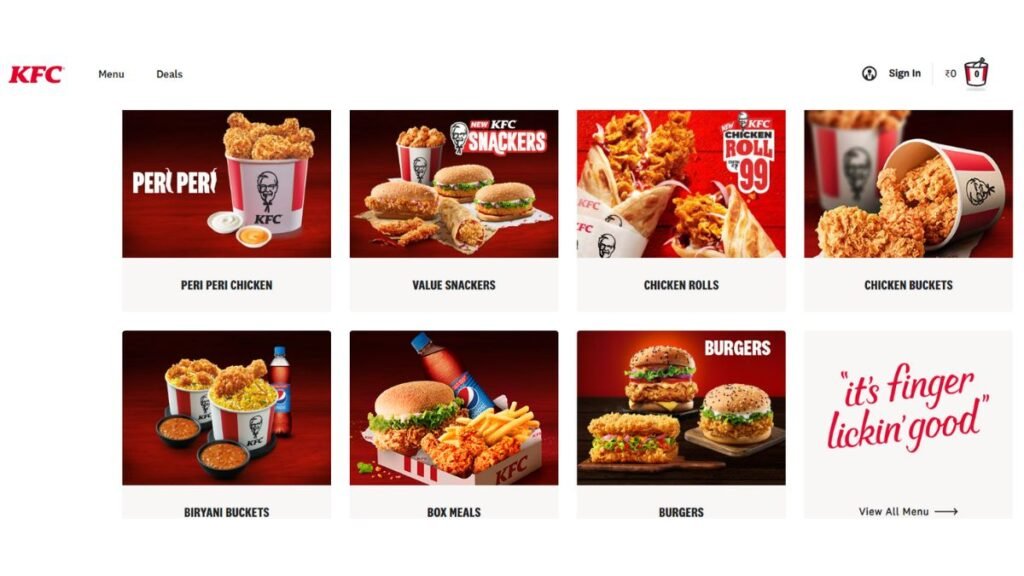
81% of SMB owners believe their business colors give them a competitive edge. And, 34.5% of purchases are driven by color influence. Different colors stimulate various emotions and connections. For instance, green represents growth, health, and nature, and red represents passion, excitement, and urgency. The renowned food joint KFC uses Red which induces a feeling of hunger in people. The bright red in fast food logos excites us.
Brand Colors increase Recall Value
By using consistent brand colors, brand recall value is increased by up to 80%. When buyers encounter your brand colors in diverse situations, their brains identify those hues with your brand. This is why brand colors are important. In other words, brand recall may make or destroy your business. Not to mention the importance of brand equity. The monetary value given to your products and services as a result of having a well-known brand.
Colors Contribute to Brand Identity and Awareness
The market is saturated today. It is difficult to get to the top. Consistent use of brand colors is an excellent approach to developing brand identity and awareness. For example: Slack. The color palette is both elegant and fun. It is primarily composed of four fundamental colors: white, black, and two tones of aubergine purple. Blue, green, yellow, and red are accent colors that go with them.

Brand Colors provide a Competitive Advantage
Colors are your brand’s hallmark, your global expression. Making your brand unique boosts your chances of outperforming competitors and earning loyal consumers. The experts at Canva recommend researching your competitor’s color selections, and to differentiate yourself, use the below questions:
- What brand colors do your competitor’s use? How do their brand identities come across?
- What do the people think about each competitor’s visual design and branding?
- What color palette do competitors employ with different sorts of content?
- What distinguishes your brand from the competitor?

Also read:
- How A Brand Marketer Takes Your Business to the Next Level?
- 10 Myths about Outsourcing Marketing Services
How to Choose a Brand Color Palette?
Define Your Brand Identity
Your brand’s colors are a reflection of its identity. As a result, your color palette should be consistent with your beliefs, branding, and message. The first step is to define your brand identity. A good approach is to create a list of keywords that define your business’s personality and character. Consider how you want the brand to be seen and what distinguishes it from its competitors.
Define what kinds of emotions you want your audience to feel. Should it be bold or gentle? Is it about grandeur and exclusivity, or is it about cost and accessibility? Once you have pinned down your brand’s personality, you will have a good foundation for selecting your brand colors.
Understand the Color Psychology
Color psychology studies how colors affect our emotions, behavior, and perception of the world around us. Consider the difference in meaning between the color blue when matched with gold, invoking images of grandeur and wealth, and the same blue when coupled with pink which appears to be more frisky.
Here is a simplified color psychology guide presented for you:
| Color | Meaning | Emotions and Associations | Common Usage & Examples |
|---|---|---|---|
| Red | Passion, Energy, Love, Danger | Excitement, Love, Anger, Warning | Clearance sales, Restaurants, Love brands. Example: Coca-Cola |
| Orange | Creativity, Warmth, Enthusiasm, Courage | Optimism, Adventure, Energy | Art & Craft stores, Outdoor brands Example: Nickelodeon |
| Blue | Trust, Serenity, Loyalty, Security | Trust, Calm, Security, Stability | Banks, Technology companies Example: Facebook |
| Green | Nature, Growth, Freshness, Stability | Health, Growth, Relaxation | Environmental initiatives, Health brands Example: Starbucks |
| Black | Elegance, Mystery, Power, Authority | Elegance, Mystery, Power, Authority | Luxury products, High-end brands Example: Chanel |
| Yellow | Happiness, Positivity, Intellect | Joy, Intellect, Caution | Fast-food chains, Educational institutions Example: McDonald’s |
| Purple | Royalty, Luxury, Spirituality, Wisdom, Wealth | Luxury, Creativity, Mystery, Sensitive, Dignified | Luxury Products, Spiritual and Wellness Example: Cadbury |
| Pink | Love, Femininity, Playfulness | Love, Compassion, Calmness | Cosmetics, Fashion, Romantic Brands Example: Barbie |
Once you have understood the color psychology, you will be able to tap into influence of colors and make informed choices for your business.
Look for Inspiration
Look around for color ideas. Analyze your competitors’ palettes and make an effort to figure out what makes them so effective. Consider how to take inspiration from their color palette and how can you set yourself apart from the competition.
You can also do market research. This includes considering all of the brand color possibilities you wish to explore and submitting them to focus groups for feedback and suggestions. You can learn how people react to those hues and how you can bind that feeling to your brand identity. Color preferences by demography can also be derived from the focus groups.
Select your Primary Color
The primary color, or core color, of your brand is the one most identified with it. For instance, Pinterest’s red color. Opt for a single color that best defines your business based on color psychology for your primary color. To achieve the perfect effect, try several hues and tints of the color you want to use, ranging from rich and dark to delicate and pastel to brilliant neon.
Select your Secondary Colors
Secondary colors add depth and character to your entire color scheme, boosting your brand identity. Use them to draw attention to voices, backdrops, and fonts while creating a color palette that communicates your distinct brand story. Choose two to three complementary hues to your primary color to make an elegant composition.
Examine your Brand Colors Across Platforms
Once you have decided your color scheme, combine them and examine them across platforms to ensure they complement one another and express the message you intended. To make your website easier to navigate, you should also evaluate your palette to ensure that they are clearly visible together. There are several online tools and browser plugins available for testing color contrast for easy access. Platforms like WebAIM and Coolers can help you test and analyze color contrast.
Explore our e-books:
Examples of Inspirational Brand Colors
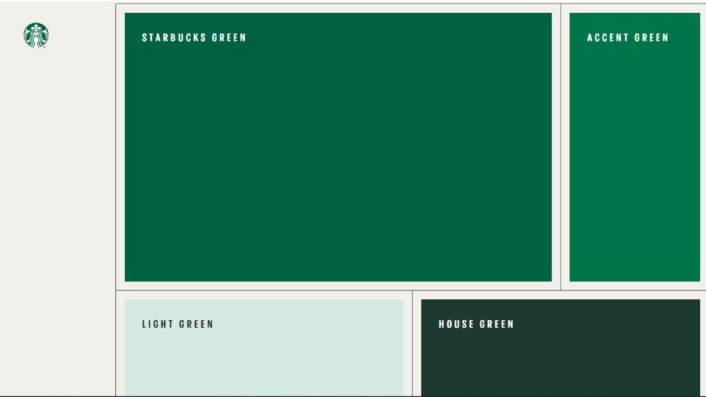
1. Starbucks
The brand colors of Starbucks are based on a green family and four neutral hues. Their predominant color is the Siren logo, a well-known hue known as ‘Starbucks Green.” This core green, referring to the brand’s rich legacy, is combined with other “fresh and inviting” hues in the extended color palette. An accent green and two subsidiary greens are included.
2. Instagram
The trademark colors of Instagram are a blue-to-yellow gradient with a variety of purples, pinks, and oranges in between. The color scheme is a reworking of the rainbow from the brand’s previous, skeumorphic logo. The vibrant color palette is intended to induce sentiments of “warmth and energy.” It also pays homage to the value of color in the app’s filters, community submissions, and other features.

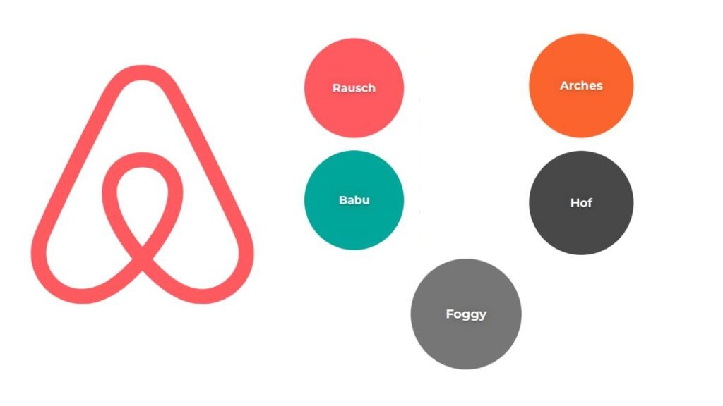
3. Airbnb
There are five different colors associated with the Airbnb brand. The most noticeable is pink (Rausch). It is also the color of the brand’s logo and is frequently utilized in the design of the company’s website. A turquoise tint, an orange, and two grays- dark and light- complement the pink.
Conclusion
In this blog, we have summed up what brand colors are, the importance of brand colors, how to choose a brand color palette, and examples of inspirational brand color palettes. Color’s key concern is their emotional connection; therefore, don’t ignore your personal sentiments when choosing brand colors.
Your corporate color palette helps you to express the essence of your brand while also creating an emotional connection with your customers. Because most brand purchase choices are based on emotions, there is no doubting the importance of color in your brand’s success.
FAQs
What is the 60-30-10 rule?
It is a timeless design rule that aids in the creation of a color palette for a room. It is recommended that 60% of the room be a dominating color, 30% be a secondary color or texture, and 10% be an accent.
What are the elements of a brand color palette?
Technical explanations of each color in frequently used forms (e.g. RGB, Hex), descriptions of why these colors were selected, and how they should be used (and, as important, how they should not be used) are the key components of a brand color palette.
What are the 7 color schemes?
Monochromatic, analogous, complementary, split complementary, triadic, square, and rectangle (or tetradic) are the seven major color schemes.